Property and Architecture

Stuart & Partners

Repositioning and rebranding an industry-leading residential lettings agency with a new brand identity and digital presence.

How do you stand out from the crowd and attract your ideal clients in a competitive marketplace dominated by bigger rivals?

View website

What we did

Challenge

Residential property letting specialists Stuart & Partners have been helping private landlords rent their properties in the Haywards Heath and wider Mid Sussex area for more than 30 years.

In a crowded marketplace dominated by bigger, national agents, Stuart & Partners was finding it increasingly difficult to stand out from the crowd.

The previous brand identity had been in use for over 15 years and was looking tired, out of date, and no longer reflected what makes Stuart & Partners different to all its competitors.

Stuart and Partners brand guidelines and application as vehicle livery

Solution

Our brief was to reposition the Stuart & Partners brand to reflect its unique place in the market and the value it offers to clients – i.e. as lettings specialists, with the in-depth knowledge and experience to guide private landlords through the complex world of renting out a property.

We started by defining the brand strategy with the Stuart & Partners leadership team, taking a deep dive into the business to thoroughly understand its value proposition, points of difference and, ultimately, its position within the marketplace.

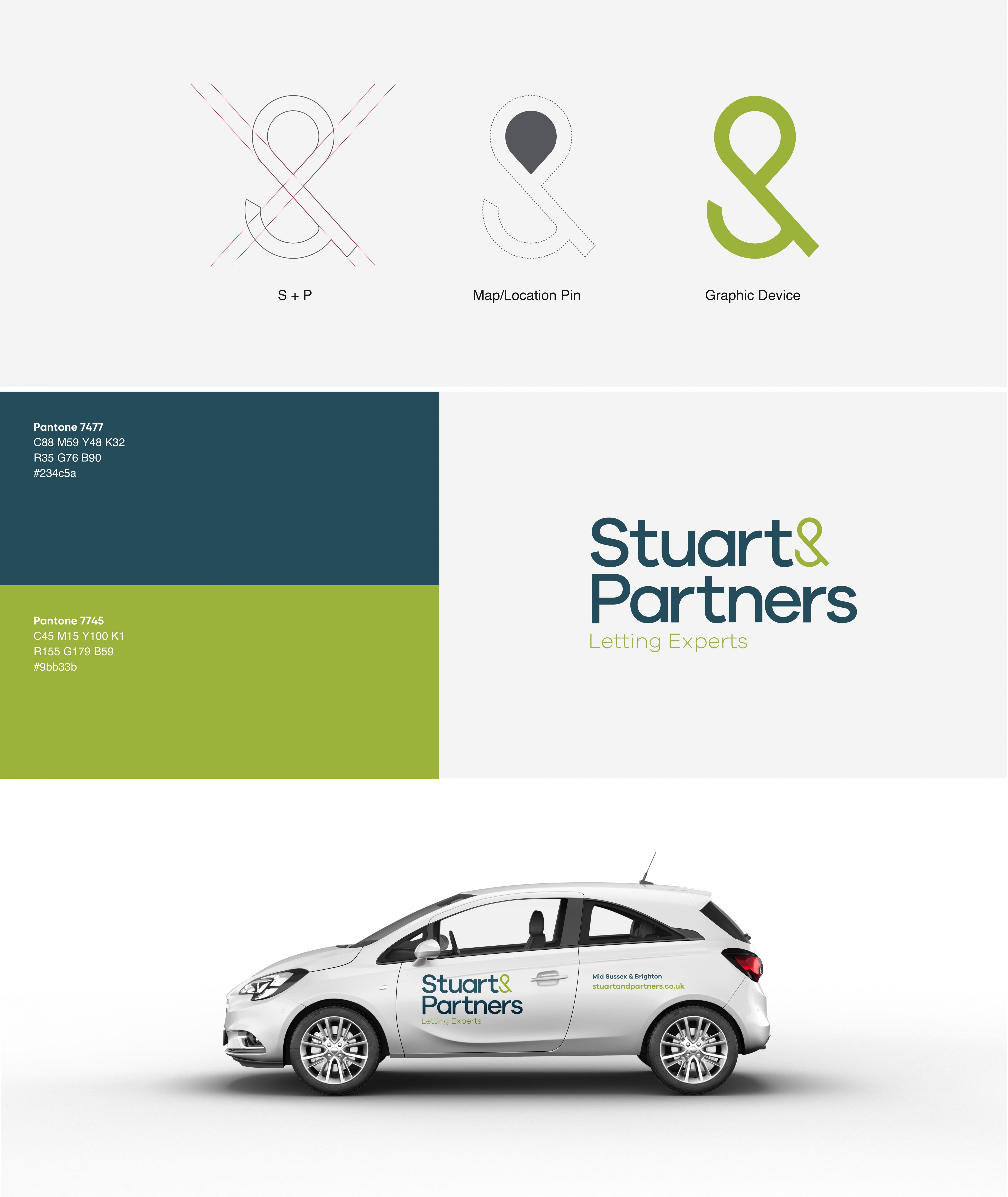
The new brand identity was developed around new, confident typography and a bespoke ampersand made from the ‘S’ and ‘P’ of the brand name. Tilting the ampersand slightly on its axis made it more grounded, and enabled the negative space to form the shape of a map pin.

The client agreed with our recommendation to move away from the previous long-standing red colour palette, which has been replaced by a confident dark blue and fresh, modern green.

The new brand identity was then applied across a range of marketing assets; we were able to make the budget stretch further by simply re-skinning rather than completely redesigning the existing website, before rebranding their social media profiles and creating new business stationery, a presentation wallet and designs for property ‘T’ boards.

Stuart and Partners brand guidelines viewed on a tablet device

Results

The new brand identity positions Stuart & Partners as a confident, professional but approachable lettings specialists, distinct from its many competitors.

Director Sam Wells feels the new brand will make a big impact on the business.

“Although our business is well-established and financially robust, we realised a refresh of our brand image was long overdue. Tomango showed us that a new brand gave us the opportunity to focus on what we do best, and take up a clear position in the market that’s different to our competitors.

We were a bit nervous about the colour change, because we wondered whether it might alienate our existing clients, but I think we definitely made the right decision and we’re thrilled with the results.

I believe this new brand identity puts Stuart & Partners in a strong position for many years to come.”

Stuart and Partners To Let and Let board designs
This rebrand has helped us focus on what we're best at and makes us stand out from even our biggest competitors. We're now in a great position to attract our ideal customers. Sam Wells, Director
Stuart & Partners

Related work